

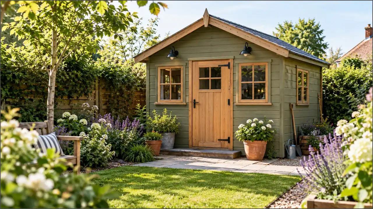
People usually buy garden sheds rather than design them. They choose a size, pick a style from a catalogue, and place the shed wherever they find a suitable gap. This approach creates a functional space that may look pleasant, but it rarely makes the shed feel like a natural part of the garden.
Treat the same purchase as a small design project and the outcome changes completely. A timber shed is one of the few pieces of architecture most homeowners will ever commission for themselves, and the principles that make buildings feel right, proportion, materiality, colour, and context, apply to it just as much as they do to a house.
Proportion before Style
The first design question is not which style to choose but how large the building should be relative to the space around it. A shed that is too big dominates the garden and makes it feel smaller. One that is too small looks like an afterthought and fails to anchor the space it occupies.
A useful discipline is to mark out the footprint on the ground with string or canes and then view it from the house, from the main seating area, and from the far end of the garden. Look at height as well: a tall apex roof reads very differently from a low pent roof, even on an identical footprint. Many designers suggest that a garden building should feel subordinate to the house and to any major trees, a quiet supporting element rather than a focal point competing for attention.
Cladding as a Design Decision
Cladding is usually discussed purely in terms of weather protection, but it is also the building’s primary texture, and it has a significant effect on how the shed reads visually. Overlap cladding has a rustic, informal character with strong horizontal shadow lines. Shiplap gives a cleaner, more refined profile. Tongue-and-groove sits flatter and tighter, offering the most contemporary appearance and the best weather resistance.
Board width and orientation matter too. Narrow boards feel more traditional and detailed, while wider boards read as calmer and more modern. Vertical cladding, where available, emphasises height and suits contemporary gardens. When comparing well-built timber sheds with different cladding profiles and roof forms, it is worth looking closely at the cladding specification as a design choice rather than purely a technical one.
Roof Form and Silhouette
The roof defines the silhouette, and silhouette is what the eye registers first from a distance. An apex roof is the archetypal shed shape, symmetrical and familiar, which suits cottage and traditional gardens. A pent roof, sloping in a single direction, is lower and more understated, and works well against a boundary or in a modern scheme. A reverse apex, where the ridge runs parallel to the front, gives more headroom at the entrance and a slightly more architectural feel.
Think about the view from the house.A pent roof slopes away from the main windows and keeps the building low in the sightline. An apex facing the house creates a gable that can serve as a deliberate focal point, especially when you arrange the door and window symmetrically.
Colour: Recede or Announce
Colour is the most powerful and least expensive design tool available, and it presents a clear choice. The building can recede into the planting or announce itself as a feature.
Receding colours are usually dark and desaturated: charcoal, deep olive, black-green, and smoky blue. They make a shed appear smaller and allow planting to take centre stage, which is particularly effective in small gardens. Announcing colours, such as soft pastels, warm creams, or a confident terracotta, turn the building into a feature in its own right. The RHS offers helpful garden design guidance on using colour and structure together, and it is worth considering how the shed’s colour will look against the planting in every season rather than only in high summer.
A two-tone approach, with the body in one shade and the fascias, door, and window frames in another, adds definition without clutter. Keep hardware consistent with the palette, as black ironmongery works well with most dark and mid-tone schemes.
Doors, Windows, and Hardware
Details are where a shed moves from ordinary to considered. Window placement should frame something worth looking at, whether a tree, a border, or a view back towards the house. Door position should respond to the paths that lead to it rather than to the manufacturer’s default.
Small upgrades make a disproportionate difference. Replacing basic hinges and latches with heavier, better-designed ironmongery immediately lifts the building. A simple timber trim around the window, a painted door in an accent colour, or a slim gutter with a rain chain rather than a downpipe all add character without complexity.
Material Palette and Coherence
A shed rarely stands alone. It sits alongside fences, paving, raised beds, and the house itself, and the building feels most resolved when its materials relate to that surrounding palette. If your fences are painted charcoal, a charcoal shed will feel coherent; if your paving is a warm sandstone, a shed in a complementary warm tone will sit comfortably beside it.
Limiting the number of competing materials and colours in a small garden is one of the simplest ways to make it feel designed. Two or three consistent finishes repeated across the shed, the fence, and the planters will read as intentional, while five or six different treatments tend to look accidental however good each one is individually.
Planting as Part of the Architecture
Planting is the final design layer and often the one that makes a shed feel settled. A climber trained along one elevation, a narrow border at the base to soften the junction with the ground, or a pair of clipped shrubs framing the door all integrate the building into its setting. Choose plants that suit the aspect of each wall, and keep vigorous growth away from roof edges and gutters to protect the timber.
Siting and Sightlines
Where the shed sits is as much a design decision as how it looks. Aligning the building with an existing axis, such as a path, the centre of the lawn, or the line of a pergola, gives the garden a sense of order. Placing it at an angle can create movement and informality. Tucking it into a corner with planting on either side softens its edges and integrates it into the boundary.
Consider how people will approach it. A shed reached by a winding path through planting feels like a destination, while one sited at the end of a straight axis becomes a terminating feature that draws the eye down the garden.
The Rules That Shape the Brief
Every good design responds to constraints, and garden buildings have a few worth knowing. Height limits, distance from boundaries, the proportion of the garden a building covers, and whether the property sits in a conservation area can all affect what is allowed without an application. National guidance on permitted development for outbuildings sets out the main limits for England clearly and is worth checking before the design is finalised, particularly for taller apex roofs near a boundary.
Designed, Not Just Delivered
None of this requires an architect or a bespoke build. It simply asks you to make each choice deliberately: the size, the cladding, the roof, the colour, and the position. A standard timber shed, chosen and placed with care, can look as though it was always part of the plan, and that is really the definition of good design.