

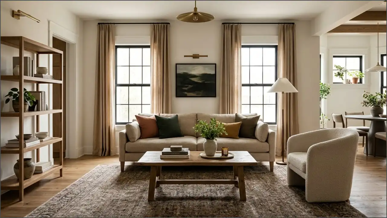
Summary of Key Takeaways
-
Prioritize scale and traffic clearances before choosing furniture styles.
-
Apply the 60-30-10 color rule, anchor palette selections around textiles first, then select paint shades.
-
Layer ambient, task, and accent lighting using consistent warm bulb temperatures.
-
Leave negative space on surfaces and group decorative objects in varying heights of three or five.
-
Mount art at eye level and position curtain rods close to the ceiling line.
Decorating a space looks effortless on social media, but standing in an empty room trying to balance color palettes, furniture proportions, and lighting can quickly become overwhelming. Many home decorators fall into the trap of buying individual pieces they love without considering how those elements interact. Learning how to be better at interior design mintpaldecor style means stepping back from quick trends and focusing on the underlying mechanics of scale, light, visual weight, and flow.
Interior design is less about copying a showroom and more about understanding why a room feels balanced. Whether updating a single living area or planning a whole home refresh, building a reliable design framework ensures every choice serves a clear purpose.
The Fundamentals of Visual Balance and Scale
The most frequent mistake in self directed design is ignoring visual scale. A large room filled with delicate, thin-legged furniture feels empty and disjointed. Conversely, putting oversized sectional sofas in a compact living area suffocates the floor plan.
Key Dimensions and Placement Rules
-
Furniture Scale: Measure floor space and clearance instead of buying for showroom size.
-
Lighting Height: Position chandeliers and pendants 30 to 36 inches above dining surfaces.
-
Rug Size: Ensure the front legs of major seating rest comfortably on the rug.
-
Artwork Placement: Center primary art pieces 57 to 60 inches from the floor.
Understanding Visual Weight
Visual weight refers to how much attention an object draws. Dark colors, heavy textures, and solid bases add heavy visual weight. Glass tops, light woods, and exposed legs feel visually lighter.
A well balanced room distributes these weights across the space:
-
Balance a heavy, dark velvet sofa with lighter timber side chairs or a glass coffee table.
-
Place taller storage units along major structural walls to keep central pathways open.
-
Anchor rooms with neutral floor coverings to allow statement furniture to breathe.
Measuring for Traffic Flow
Before ordering furniture, map out clearance zones. A major walkway needs 36 inches of clearance to allow two people to walk past each other comfortably. Secondary paths, such as the gap between a coffee table and a sofa, require 14 to 18 inches. Skipping this step leads to crowded layouts that restrict movement regardless of how beautiful the furniture looks.
Building a Cohesive Color and Texture Strategy
Color selection often stalls a project. A common issue is picking wall paint before selecting key textiles like rugs, upholstery, or curtains. Paint comes in thousands of shades and can be custom mixed. Finding the right fabric to match an existing wall paint is far harder.
The 60-30-10 Rule in Practice
To build a balanced color palette, divide your room colors into three distinct categories:
-
60 Percent Dominant Color: Applied to walls, large area rugs, or dominant furniture pieces. This acts as the room foundation.
-
30 Percent Secondary Color: Used in drapery, accent chairs, or built-in cabinetry. It offers contrast while staying grounding.
-
10 Percent Accent Color: Reserved for artwork, throw pillows, vases, and minor decorative objects.
When exploring how to be better at interior design mintpaldecor principles encourage using texture to add depth when working with muted or monochromatic palettes. Mix matte plaster walls with polished stone, boucle fabrics, and warm brushed metals to keep low contrast spaces from looking flat.
Layering Lighting for Function and Ambience
Relying on a single overhead lighting fixture creates harsh shadows and flat lighting. A properly designed room uses three distinct layers of light:
-
Ambient Light: General illumination from recessed ceiling lights or flush mounts.
-
Task Light: Focused illumination for specific activities, like reading lamps or under cabinet kitchen LEDs.
-
Accent Light: Decorative lighting used to highlight art, architectural details, or shelving.
Managing Color Temperature
Keep bulb color temperatures consistent across the room. Residential spaces perform best between 2700K warm white and 3000K soft white. Mixing cool 4000K bulbs with warm 2700K lamps distorts paint undertones and fabric choices, creating an inconsistent atmosphere.
Curating Decor and Avoiding Over-Styling
A common pitfall is filling every open shelf or surface with small trinkets. This visual noise detracts from key architectural features and makes maintenance difficult.
The Power of Negative Space
Negative space gives the eye a place to rest. On a large bookshelf or coffee table, leave at least one third of the area completely open.
Grouping Objects in Odd Numbers
When arranging decor accessories, group items in sets of three or five. Vary the height, texture, and shape of each item within the group:
-
High Element: A tall ceramic vase or candle holder.
-
Medium Element: A structured book stack or medium bowl.
-
Low Element: A flat decorative tray or small sculpture.
Applying these grouping rules shows how to be better at interior design mintpaldecor stylists avoid cluttered surfaces while keeping vignette layouts intentional.
Fixing Common Room-by-Room Mistakes
The Living Room: Hanging Art Too High
Art hung near ceiling height breaks the visual connection with the furniture below. The center of a focal artwork piece should rest 57 to 60 inches from the floor, matching average human eye level. When placing art above a sofa or console table, keep the bottom of the frame 6 to 8 inches above the furniture line.
The Dining Room: Restrictive Rug Sizes
A dining room rug must extend at least 24 inches past the table edges on all sides. This allows chairs to stay on the rug surface even when pulled out for seating, preventing chair legs from catching on rug borders.
The Bedroom: Ignoring Window Treatment Placement
Hanging curtain rods directly above the window frame shortens the look of the room. Mount the curtain rod 2 to 4 inches below the ceiling line or crown molding, and extend the rod 8 to 12 inches wider than the window frame on each side. This trick makes windows look larger and ceilings appear taller.
Developing Your Personal Design System
Consistent execution relies on building a clear plan before spending money. Following a systematic process reduces costly order returns and layout mismatches:
-
Measure floor space and record architectural features.
-
Identify the natural focal point of the room, such as a fireplace or window view.
-
Draft a layout plan ensuring minimum 36 inch walkways.
-
Select anchor pieces including rugs, sofas, and dining tables.
-
Finalize wall finishes, lighting layers, and decorative accents.
Mastering how to be better at interior design mintpaldecor standards require patience and iterative adjustments. Treat rooms as functional spaces that evolve, prioritizing quality scale, proper lighting warmth, and restrained decor arrangements. By focusing on these core design mechanics, you can transform any room into a balanced, comfortable space.